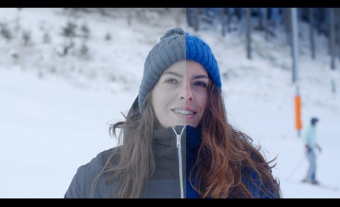
Both film and commercial looks are great depending on your project. If you’ve ever been stumped on how to achieve either look, you know how frustrating it can be in color grading at that stage of production. In this tutorial, we’re going to cover how to achieve either aesthetic through a step-by-step example in DaVinci Resolve.
This is a good occasion as any to check out our biggest giveaway ever, which includes 5 creators packs that are filled with everything a filmmaker needs, from LUTs and overlays to motion graphics.
![]()
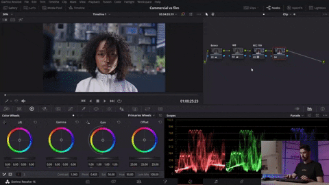
The commercial look
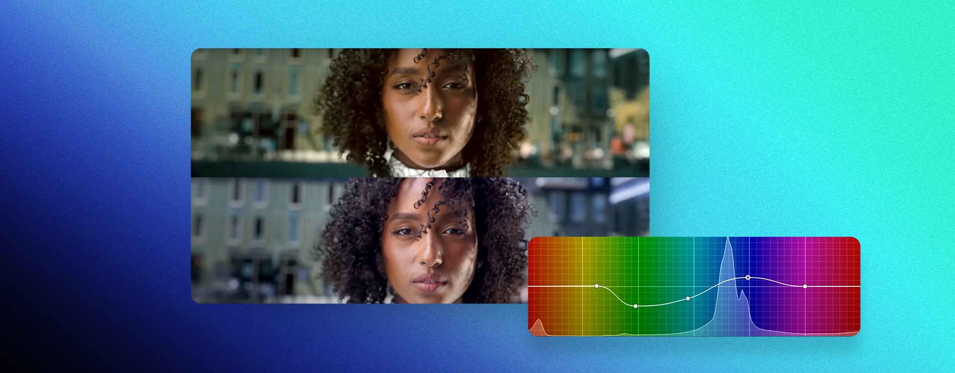
If you’re going more commercial, you’ll want the image to be brighter, livelier and have highlights that make the image pop. With the footage of our actress dropped into the program, it’s time to start bringing that effect to life.
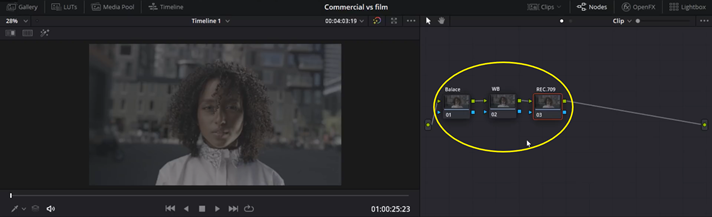
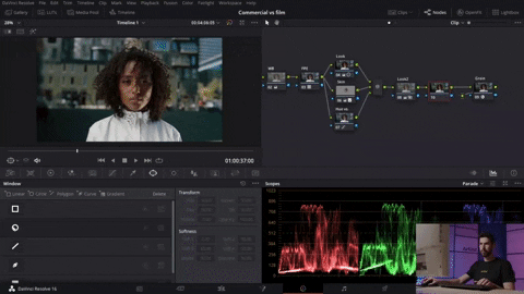
To begin, you’ll want to organize your workflow by arranging the different nodes sequentially. In our example, we set 3 nodes - Balance, white balance (WB) and REC.709.
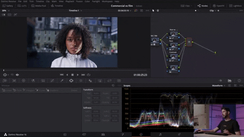
The footage we are working on was shot on a Red camera, so we need to go into LUTS, scroll down to Red and then choose RedLog3. For our footage, make sure you make the right selection so that it gives you the right conversion.
When you have a warm image, to achieve a cooler, crisper image, go into your node and lower the temperature (Temp) and Tint. Then, go into your first node (Balance) in order to stretch up the Gain to achieve greater highlights and a brighter look. At the same time, you’ll want to pull down your Lift in order to make sure your blacks are in the right spot and not elevated. By doing this simple base work, you can see that the image is well on its way.
Moving on, you’ll want to create several parallel nodes in order to bring out certain colors while taking out the ones that will overwhelm the image. Press Alt+S (Opt+S on Mac) to create a new node and Alt+P (Opt+P on Mac) to create a parallel node. Go on to your Curves and select Hue vs. Sat. Bring down and stretch out your greens while doing something similar with your blues. It’s important to not overdo this part because you don’t want to have an inadvertent “black and white” background. Label this node Hue vs. Sat.
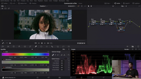
Going onto skin tone, click on Hue vs. Lum to pop her skin. Bring up the yellow to bring out the highlights in her skin.
Going back to Hue vs. Sat, you’ll want to pop out the saturation in the red and purple. You’ll see right away that it brings up the highlights on her as the subject while avoiding an entirely desaturated image. Remember to label your nodes!
Moving onto the next node, let’s add some contrasts to make use of the shadows. In your Curves, create a slight S-curve that doesn’t’ crush the shadows while making the image pop. This will give the necessary punch to the image.
Moving on, you’ll create a serial node that will make a vignette in order to pop out the subject (the actress). Create the new node using alt+S, and once you’re in it, create a Window you can scale out from her face. Working out of that window, bring up your Curves a touch.
You’ll then create an opposite node by clicking alt+O (Opt+O in Mac) in order to create contrasts at the edges. After creating your opposite node, bring down the Curves, and you’ll notice the subject pop much more clearly with the contrast of the curved-down background.
Create a new node, and then go into OpenFX to search for Glow. This effect is only available for users with the paid version of Resolve. Dropping the effect in, you’ll want to make it subtle enough to not overwhelm the image, so bring down the brightness and opacity to make sure it doesn’t.
Going back to the additional parallel node we created, we’ll add a little saturation to the surrounding colors. By playing around with Hue vs. Sat, you’ll be able to make sure that you didn’t forsake the other colors in the image. After all your hard work, you’ll notice an image on the cooler side, but with enough crisp and life to fit perfectly in any commercial.
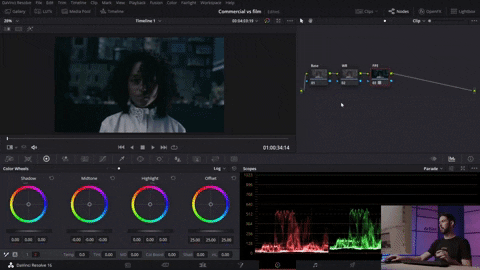
The film look
Film is notoriously dirtier, grittier, and filled with grain that just does not exist in commercials. You’ll want your image to be more cinematic, and below are the steps to do just that!
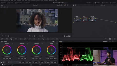
We begin by creating 3 nodes which we named Base, White Balance and Film Print Emulation (or, FPE). We then go into our LUTS, click on Film Looks and choose the LUT you want. We chose Fuji D65. Don’t be worried about the initial image. You’ll course-correct by returning to your 1st node adjust through your Primary Wheels. Push up the Gamma, stretch out the Gain and bring back the Lift by bringing out the shadows. Then, move into your 2nd node to drop the temperature. Finally, return to your 1st node to add saturation in order to really give your image the beginnings of a cinematic feel.
Create a new node where you’ll bring down your overall exposure. This will add more drama to your shot and create more of a mood. Push your Saturation up, inject greens into your shadows, and then use your Gamma to balance everything out. You’ll notice the skin is turning slightly green. Don’t fret! You’ll fix that by creating a parallel node.
Press alt+P to create your parallel node. Select the skin with the qualifier and create a window to keep your work just on the face (You can also track that window if you want).
Once you have your work isolated, go back into your Color Wheels to push more magenta and clean up your Saturation. Then, push the Shadows to give the image even more balance.
To control the colors in the background individually, create another parallel node. Go to Curves and then Hue vs. Hue and set the curves of the colors you want. To control the luminance of your hue, go to Hue vs. Lum and change it until you get the desired luminance. To increase the highlights even more, create a new node where you’ll take the Gain towards yellowish-green and then push the Lift in the same direction. Make sure that you balance out the work by moving the Gamma to the opposite direction so that you don’t create too vibrant an image. You should see a strong image that you’ll want to make sure isn’t too strong or sharp. Control this by going into your node key to dial back the output to make sure your work blends well. You should see a lot more character already!
Finally, it’s time to add film grain! Go into your OpenFX and select the grain you want. We chose 16mm 500T as a starting point. While this is a much grainier film texture, it will accentuate the cinematic look we’re going for. Before adding the grain, though, we’ll add a Vignette and pull the Curves down. To not darken your subject, reverse it to make the background darkened.
Finally, add a Glow to the image to allow some pop while not taking away from the grit of added grain. Voila! Your start to finish image is worlds apart from its initial form. Congratulations!
Wrapping up
Whatever your project, executing the proper look consistently and thoroughly. Whether shooting a commercial or documentary, a commercial look will absolutely make your image pop and glow. If you’re doing more narrative work, the cinematic look will deliver the warm feeling of being in the theater. No matter your choice, this tutorial is an example of taking the same initial footage and grading it to your preference. Check out some more color grading tips on our blog, try them out on your own work, and we hope to see it soon. Until next time, stay creative!