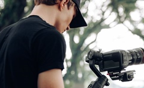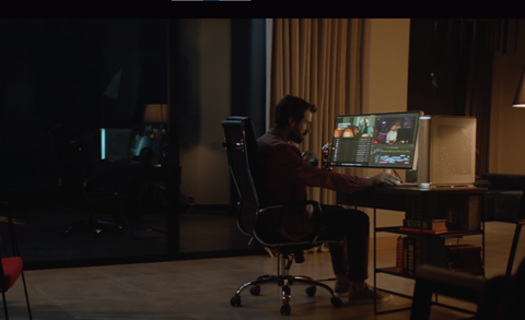
Thanks to the ever-improving creative editing tools at our fingertips these days, we’re now able to achieve almost total control over digital filming and production. What once needed a prohibitively expensive editing suite can now largely be done on a good desktop (or even laptop!) and the right editing programs. Technology has really made leaps and bounds when it comes to editing, and so achieving the right color gradient is entirely possible; the trick now is what to choose and how to achieve it amongst the myriad of software tools. Hopefully, in this article, you’ll find some insight and inspiration into how to find and execute correct color grading.
1. Camera negative: RAW and LOG formats
As technology has come on leaps and bounds in video recording and post-processing, we can get a great deal of information or latitude stored on the camera’s memory card. The more data we have generally means the more capabilities we have to manipulate and play with the resulting images. The saved data or ‘camera negative’ contains all the information you recorded from your shoot and will be the basis for all subsequent editing and, in this case: color correction and grading.
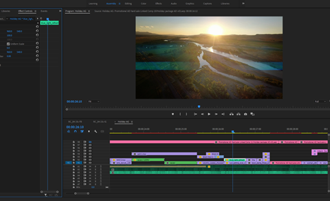
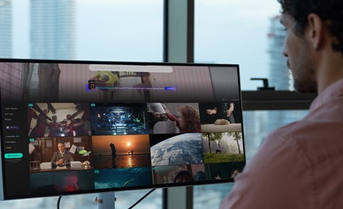
You can even find software that handles color correction on your smartphone in many cases, but we’ll be assuming you’re using a more sophisticated non-linear editing system such as Adobe Premiere Pro, Final Cut Pro or Davinci Resolve, all of which are commonly used on small and big-budget productions alike. In this article, we’ll include screengrabs from DaVinci Resolve to highlight color correction and grading processes.
2. Color correcting
This is usually the first step in the process as it’s essentially configuring the “standard” before further fine adjustment. This would be things like white balance, exposure, contrast and more to give us consistent visuals from which to develop. Along with providing a consistent image, this initial color correction process ensures that any color changes or creative grades will render correctly when we add them later. It must be consistent across the board, so set the same values for footage you might have gotten from different cameras.This step is all about setting the foundations to build from.
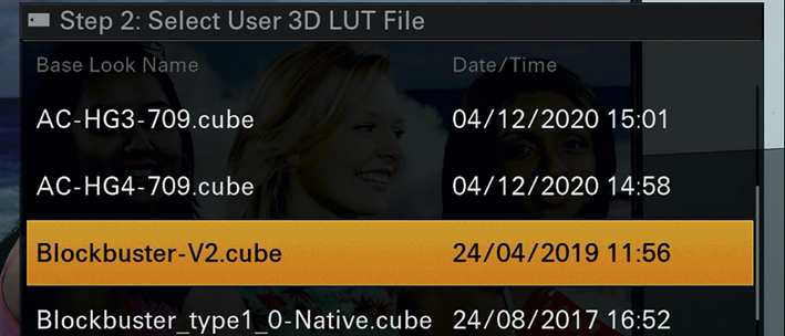
3. Applying a lookup table (LUT) preset
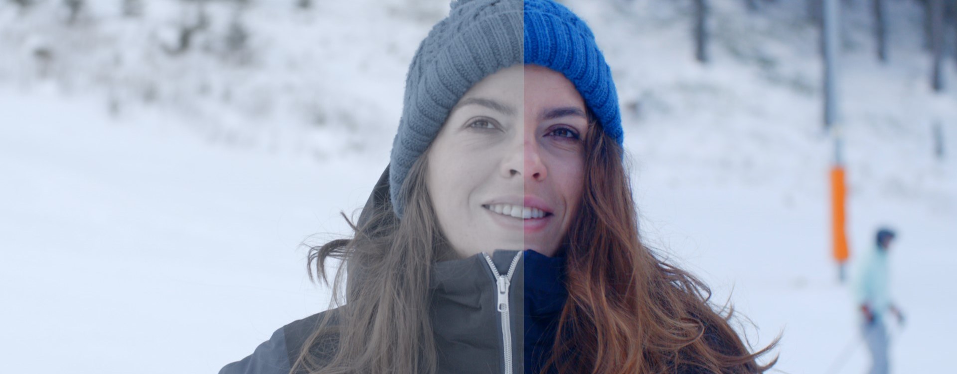
This is a preset adjustment for your camera type that adjusts all the values to a known standard, for example, Rec. 709 LUT, which is a common standard in HD broadcast television. After selecting the input LUT, it’s also wise to white balance the footage. It is up to you whether you choose the camera’s automatic features or manually select the temperature. An example of this is the following image shot with a Sony FS7, recorded in S-Log3. The left half of the below image is the untouched Log image straight from the camera, while the right has our Rec. 709 LUT applied to it.
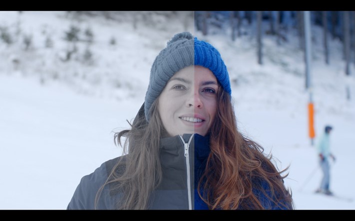
Of course, you can see the image improvement of the LUT preset, which comes as no surprise, but it is always worth considering where and when you’re doing the shoot. So in the above scene, we know it will be well-lit with just natural light - no light-obstructing obstacles (apart from occasional clouds) and a clear day with light bouncing off the snow on the ground. This can help to inform what colors and gradient you may want. As you can see, the above image is more or less as the human eye would see the colors without too much temperature change one way or the other.
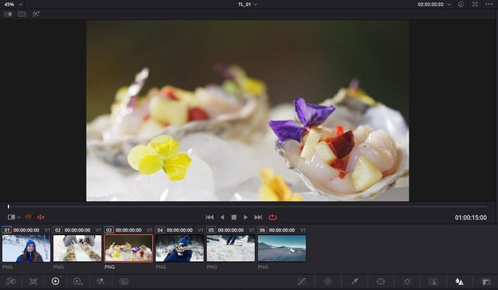
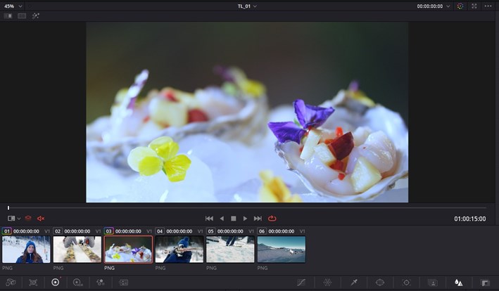
4. Unifying all of your clips
As previously touched on, consistency is key in a lot of cases. The human eye is quite adept at picking up inconsistencies, so ensuring that the film is all colored correctly is an essential part of the editing process. Generally, when unifying color across the board, we’ll first look for the most average clip in terms of exposure and levels on the timeline, then try and match that to the rest of the footage. This could be unifying the blacks and whites or employing secondary color correction to ensure continuity with prominent colors throughout the timeline.
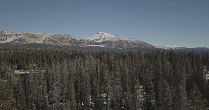
I’ve selected the above shot as one that is incongruent with the other shots, quite simply because it’s an interior shot, so the color palette doesn’t feel quite right.
The solution: Using the auto white balance ‘picker’ on the plate reflection and rolling the color temperature toward warmer using the manual override. Simple but effective; this now looks much cleaner and in line with the rest of the scene. Quite often, you’ll find that only minor tinkering needs to take place. For instance, the below image only required a light grade to bring out the sky saturation as well as some contrast to the distant mountains.

5. Achieving the right creative grade
As mentioned earlier, it’s pretty much essential that you have a color or tone idea before shooting. Obviously, you can completely change it all in the editing suite, but I’ve found that it helps inform my shooting when I have an idea of what it will look like in the end. The reason for this is that shoots are so often meticulously planned out before any filming - color can inform the wardrobe, set design and other aspects of a shoot, so it’s really worth considering. Luckily this process is made very easy by the fact that many cameras will now give you a preview LUT applied to the monitor which isn’t baked into the final footage.
Having the preview LUT preset is great as it can inform the shoot without being irreversible since you can completely change the color grade in post-production. It can also be handy if you have a reference that you’d like to emulate or work with, as the custom preview LUTs give plenty of flexibility to try out certain options if you’re still hunting for the perfect gradient. The impact of the LUT presets can even change the time of a scene. For example, if you are filming in daylight but want a night scene, applying the right LUT can achieve this effect:
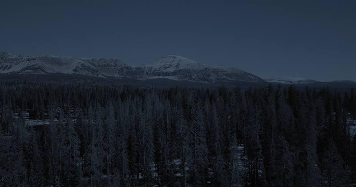
You’ve probably noticed a few scenes in films or TV shows where the colors look a bit strange for a night scene. This is most likely because it was filmed during the day with the intention of it being a night scene or just decided at a later stage of production that this was going to be a night scene, meaning that the ‘night’ effect has been added post-filming to maintain story consistency. Having said that, post-processing is becoming so sophisticated these days that it’s often hard to tell if a certain shot was actually filmed at night or if it’s just editing!
When thinking about your color grade, it’s important to know the overarching mood and tone of the story. Perhaps you want scenes to be dark, making details a bit harder to see with shapes coming in and out of focus, or maybe you want all the colors to be supersaturated? The story and emotion will largely inform your decision, but don’t be afraid to investigate - there is so much variety in terms of editing possibilities and in-camera LUTs that it’s worth experimenting with grades to learn what impact it may have on the viewing experience.
Author Bio:
Andrew Farron works for Fable Studios, a Creative-led boutique video and animation studio that creates tailored brand stories that endure in your audience’s mind. Fable combines your objectives with audience insights and inspired ideas to create unforgettable productions that tell the unique story of your brand.